Sunday, 27 December 2015

60-Degree Cameras the Next Big Thing


I've seen many POV cameras over the years, but early models were not ready for primetime.

GoPro, however, wisely targeted the extreme sports crowd, who helped the company make a name for itself and drive demand for its cameras. In fact, you can trace the current push for police body cams to the popularity of the GoPro.
360fly CameraA few months back, a company called 360fly dropped by my office to show me one of the first consumer POV cameras that could take 360-degree videos and sprawling panoramas, and I could see how this could be the next major evolution of POV video. Recently, I got some hands-on time with the $399 device and found that it adds a completely new dimension to the POV experience.I will be the first to admit that I am too old for extreme sports or even highly active sports, so my tests were a bit mundane. I took 360 videos of the dogs running in the yard and kids playing soccer at the local park, and was happily surprised by the new dimension a 360-degree video camera had on even my simple experiences. I even put it in the middle of the table at a family meal.
The 360fly camera comes with various mounts, but it uses the same type of connector as GoPro, so it will work with GoPro helmets and various Go Pro mounts, too. The camera and a variety of mounts will be sold exclusively at Best Buy stores in October. One other important thing about this camera is that it is waterproof for use up to 50 meters deep.
The 360fly has one other feature that is unique to its platform: a VR capture mode. You can then view those videos via Google's Cardboard VR goggles. I am personally fascinated with the whole concept of 360-degree cameras. While a direct view GoPro delivers great experiences, adding the ability for a person to see everything around them makes a POV video even more interesting and entertaining.
In fact, I have always thought that this is the one camera I would like to have in my car. I currently have a back-up camera, but a 360-degree view that got rid of blind spots would be worth the price for safer driving. Of course, self-driving cars already figured this out.
I can also see the 360fly being used as a tool for surveyors, insurance adjusters, military, first responders, and other professional markets where getting the whole picture would be important to their work. I also think that since this is HD-quality video that Hollywood will embrace this camera for use in movies.
While GoPro and other direct-viewing video cameras will not go away, I think adding a 360-degree view will become even more important to the POV camera experience.

Magic Keyboard was made to hit the road

With a compact, sleek design and Lightning-rechargeable internal battery, Apple's Magic Keyboard is a prime candidate to replace your current portable keyboard, though its utility for Mac owners is less clear.


The keyboard is for many users the main mode of inputting data into their computer and as such becomes the primary point of interaction between human and machine. It therefore needs to be comfortable, easy to use and robust in construction.

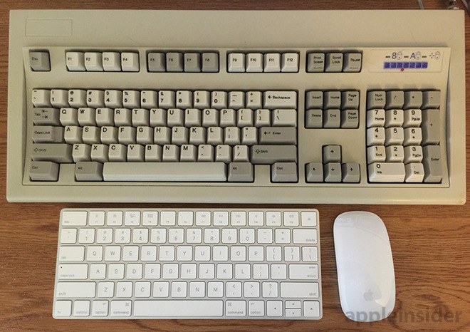
I have always preferred function over form. Most of my work is accomplished on a Mac mini hooked up to an old IBM Type 102 keyboard, a beast of a device with loud and solid mechanical switches. In fact, I've grown somewhat dependent on this "clicky" tactile feedback, it lends itself to fast, accurate typing.

With its quiet scissor switch keys , I expected the Magic Keyboard to fall into that ilk of accessory that provides underwhelming performance and mushy key feel, but I was pleasantly surprised to find that is not the case.

Design

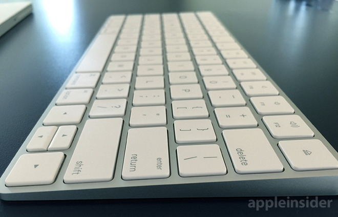
My first thought when taking Magic Keyboard out of the box was that it's small, but looks can be deceiving. The keyboard's footprint is diminutive at 10.98-inches wide and 4.52-inches deep, but full size keys underpinned by sturdy mechanisms make it feel much larger in use.


As we have come to expect with Apple products, the build quality is top notch with stiff plastic keys set into a wedge-like aluminum body. A white plastic bottom cuts down on excess weight, while four rubber feet — one on each corner — prevent the 0.51-pound peripheral from slipping around. Also, thanks to a new internal battery design, the tallest point on Magic Keyboard's wedge shape tops out at 0.43 inches.

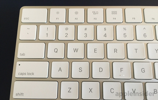
Keys include the usual assortment of function buttons for quick system access to media and volume control, screen brightness for a laptop, Mission Control and more, while a lone status LED sits under the Caps Lock key. Around back, Magic Keyboard has a physical power switch, a lightning port for recharging and a cutout in the aluminum case to allow for better Bluetooth transmission.

The Magic Keyboard can be turned off if you want to save power, but it also senses when you are not using it and go into a lower power standby mode. According to Apple, the keyboard can be charged to full in about two hours and should go about a month or more on a single charge with standard use.


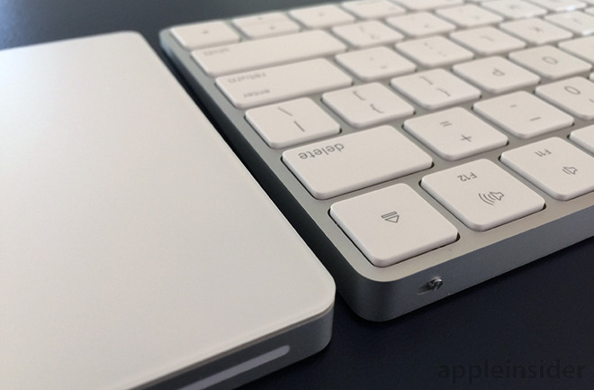
Apple kept its other Magic accessories in mind, as the keyboard's lines perfectly match those of the Magic Trackpad 2. And with snow white exteriors, the peripherals are aesthetically consistent.

Setup and usage

When purchased separately, Magic Keyboard comes with a lightning cable for charging and pairing purposes. When the keyboard is connected via cable to a host Mac, OS X throws up a notification informing users that it's ready to use, no configuration required. If you are uncomfortable digging into the settings of your Mac to pair Bluetooth accessories and want things to "just work," this keyboard is for you.


As previously mentioned, Apple chose to implement an upgraded scissor mechanism under each key, which it claims is 33 percent more stable than past designs. Indeed, we found the key platform to be rock solid, though the design inherently limits key travel. I was somewhat unaccustomed to such a short downward stroke, but it became natural the longer I used the keyboard.

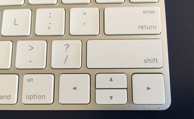
In general, keys are large enough to provide a comfortable typing experience that doesn't feel cramped or constrained. Importantly, I was able to type swiftly and accurately and there is a very subtle sound and solid tactile feedback when typing. The only keys I had trouble with were the up and down arrow keys, which carry over the half-key design from prior Apple keyboards but are now flanked by full size left and right arrow keys.

On Mac the Magic Keyboard is an incremental upgrade, but when paired with iPad, iPhone, or even Apple TV, its small size and lightning port make it a great keyboard to use while traveling. My iPhone 6s Plus has become a preferred method of typing and data entry when on the go, and while it won't replace a laptop, pairing the Magic Keyboard provides the next best thing.

The build quality of the keyboard lets you know it's going to last for years with normal use and can take the rigors of travel if you do decide to use it as a portable keyboard. Plus, with Lightning-enabled charging, you only need to take one extra device when traveling: the keyboard itself.


Conclusion

The Magic Keyboard, while a nice incremental upgrade, is not a must have purchase for desktop users, especially those already in possession of an older Apple wireless keyboard. For road warriors and iOS power users, however, the keyboard's portability and internal battery, not to mention aesthetics and build quality, make it well worth a look.

Personally, I'm too accustomed to my old time mechanical keyboard to change to Magic Keyboard full time. Away from the Mac, however, Apple's new peripheral is a welcome addition to my iOS hardware arsenal.

Score: 3.5 out of 5

Pros:
  • Compact build with full sized keys
  • One month between charges
  • Great size for travel
Cons
  • Incremental hardware upgrades
  • Pricey at $99
  • Odd arrow key layout

The Best and Worst of Mobile in 2015


 There are no fixed winners in the tech world. It's never the end of the story. Things can always change. In 2015, some of the mighty fell a few notches, but others recovered from a rough few years.
We said goodbye to the struggling Firefox OS, but BlackBerry continues to hang on. The Apple/Google war rages unquenched. Here at PCMag, we reviewed around 100 phones (mostly Android) and 40 or so tablets (mostly Windows), which shows there are a lot of choices in mobile tech, even if you may have to hunt to find some of them on the shelves.
I've been following the mobile world for a dozen years now, and it takes more to impress me than it used to. Here's my best and worst of 2015 in mobile.

The Worst of Mobile 2015

Qualcomm Snapdragon 810 Phone

1. Qualcomm's Snapdragon 810

After dominating the smartphone chip world almost as long as smartphone chips have existed, Qualcomm made a series of embarrassing flubs this year. Its flagship Snapdragon 810 lacked the company's signature custom CPU cores, making it harder for Qualcomm to compete with Mediatek and Samsung. Early versions had notorious overheating problems, and later versions couldn't differentiate on performance compared to other industry leaders. While Qualcomm still makes the best modems in the business, it needs to come back hard with the Snapdragon 820 to regain the faith of major customers like Samsung. 2. Every Android Tablet Over $100
Yawn. While Windows 10 roared this year with a slew of different price points, form factors, and productivity features, Android snoozed. All we saw from major mid- to high-tier Android tablet manufacturers were incremental changes, none of them addressing why you would want an Android tablet rather than an iPad (with better entertainment apps) or a Windows tablet (with better productivity apps). Interesting tablets fell left and right. Nvidia had to recall the Shield, Samsung killed the Galaxy Note tablet line, and the Google Pixel C was almost unusably buggy, putting the capstone on a year in which Google seemed uncertain about Android's purpose.

3. All Smartwatches, Except the Pebble
Smartwatches are a perfect example of a product category that manufacturers are trying to foist on us without ever explaining why we might want them. Android Wear watches are too similar, have confusing UIs, and set your phone's battery on fire. The Apple Watch has sold very well as a fashion item, but it also pretty much gutters out when you try to move its utility beyond notifications. At least the Pebble line embraces the fact that nobody knows what to do with these things beyond showing notifications.
Pebble Time Round

4. The U.S. Handset Duopoly
In most of the world, smartphone makers compete vigorously at every price level. Huawei, Sony, Xiaomi, and local manufacturers like Micromax and Wileyfox all have their strengths. Not so here in the U.S., where the smartphone market is so dominated by Apple and Samsung that it freezes everyone else out. Apple and Samsung now own 87 percent of U.S. postpaid phone sales, up 6 percent from last year. That means we're getting fewer diverse options, less competition, and less innovation than other nations.

5. Windows 10 Mobile
What a shambling disaster. On phones, Microsoft is still a circular firing squad. New devices chief Panos Panay seemed unimpressed with the Lumia 950 and 950XL, which are getting very low-key launches in the U.S. The OS, meanwhile, is still extremely buggy. Another own goal in a series of own goals.

Lumia 950 Embed 1

The Five Best Things in Mobile for 2015

My five favorite things of 2015 don't include any phones. That's on purpose. There were a lot of good phones this year: the iPhone 6s, the Galaxy S6, the Moto X Pure Edition, the LG V10, the Huawei Mate S. But after personally reviewing 648 phones for PCMag, it's hard for me to choose one unless it's a huge jump forward.
There are a few things I considered adding to this list, but they're not quite there yet, like VR. I considered Apple's 3D Touch, which is really neat, but hasn't had enough third-party uptake. I really wanted to put in USB-C, but it needs another year. But these five things hit the market with a bang this year.

1. T-Mobile/Sprint Competition
The Uncarrier was the great story of 2014, with T-Mobile roaring back to become a real LTE competitor in the U.S. Now we have T-Mobile and Sprint duking it out, thanks to a much-improved Sprint LTE network and Sprint's combative CEO, Marcelo Claure. The U.S. strategy of refusing to let the big carriers merge from four down to three is paying off handsomely, as they're all aggressively improving their networks and undercutting each others' prices. While we still pay more for our mobile data than people in many other countries, our situation's a lot better than it would be with fewer competitors.

2. Periscope and the Livestreaming Revolution
I mocked Meerkat when it first came out, but now I have to give a big nod to the democratization of livestreaming. A big part of my original mockery was because I had to shift paradigms; I grew up with the first generation of camgirls, and I really did see the current livestreaming moment as just more narcissism. Yes, it often is narcissism (see Martin Shkreli playing his guitar to teenagers), but it's also a major change in the way we're communicating online.
Periscope Tips

3. Windows 10, on everything except phones

Windows 10 on desktops, laptops and tablets is brilliant. Windows 10 cured the fungal diseases afflicting Windows 8.1 and has led Microsoft into a creative new world of 2-in-1s and convertibles, led by the excellent Surface Pro 4. Windows 10 is killing Apple and Google when it comes to offering comprehensive productivity solutions that are still portable, but don't compromise.

4. The Amazon Fire
The Amazon Fire, the first decent $50 tablet, is absolutely terrific, and marks a whole new product category. We've seen really cheap tablets for a while now, but they've almost all been very low-quality, gray-market imports. With the brilliant idea of a six-pack for $250, Amazon makes quality tablets an impulse buy, giving you one for every room of your house and every child in your family. Amazon has redeemed itself from the Fire Phone.

5. The Apple Pencil
The iPad Pro is a big iPad. But the Apple Pencil is a quantum leap. It's ridiculously better than any other stylus on the market, even better than Wacom products. I'd venture that it's better than the Cintiq, although I know that's controversial. Now that Samsung seems to have inexplicably killed its formerly excellent Galaxy Note 10.1 line of tablets, the Pencil is the best portable note-taking and drawing implement out there.
Apple Pencil Review

3 Big Car Tech Trends From 2015


Every year technology becomes more of a force in the automotive space, and 2015 was a particularly prolific period. But as the three most significant developments of the past 12 months show, not all the changes were positive and some were downright disruptive. This trio of developments not only helped shape the past year in car tech, but will likely have ramifications into 2016 and beyond.

 1. The Car Hack Heard Around the World
Prior to this summer, car hacks had primarily been performed by researchers after they had hard-wired into a vehicle. But then security experts Charlie Miller and Chris Valasek, who first gained attention in 2013 by taking control of a car while in the backseat with a journalist at the wheel, returned with a wild and willful second act.
The same journalist drove Miller's 2014 Jeep Cherokee on a St. Louis highway while the two hackers remotely played harmless tricks like cranking the stereo. But then the researches upped the ante and performed more dangerous intrusions such as disabling the transmission while a big rig bore down on the vehicle. The stunt prompted Fiat Chrysler to recall millions of its vehicles, and was followed by the introduction of a bill in the U.S. Senate designed to protect car buyers via a rating system based on a vehicle's vulnerability to hacking, though it has not seen any action.
Several other high-profile hacks occurred within weeks, and the media attention and public concern caused automakers and suppliers to alter their connected car strategies—and hire some of the same researchers who caused the outcry—even though there hasn't been one single case of hacking in the wild.

2. Tesla "Autopilot" Gets Oversold
Although Tesla made clear that "truly driverless cars are still a few years away" when it released its Autopilot feature for the Model S via a software upgrade, some drivers didn't get the message. This led to videos showing near-collisions from drivers who relied too much on the semiautonomous technology or did stupid and dangerous things such as shaving and eating breakfast while driving on the German autobahn and climbing into the back seat as a Model S barreled down a Dutch highway.
Lost in all the media hoopla is that Autopilot didn't really add anything that other cars with semi-autonomous driving technology already have, except for an automatic lane-change feature. But it made clear that fully self-driving technology—or at least human drivers being prepared to handle letting go of the wheel—is still years away.

3. Apple CarPlay and Android Auto Take Over
It took more than a year after they were introduced for Apple CarPlay and Android Auto to finally appear in new vehicles—during which time some automakers expressed reservation about allowing the tech giants' smartphone integration platforms into their dashboards and access to their data.
But when the two systems started to trickle into vehicles, they made a very compelling case for skipping automakers' own infotainment systems with their kludgy interfaces and convoluted and sometimes costly connection schemes.

Car Technology

After having a Pioneer aftermarket head unit with CarPlay installed in one of my own vehicle and trying it in several new models from General Motors, I found that it sets a new standard for seamless automotive infotainment. In addition to largely superior music, phone, and messaging features, the Maps function is better than most built-in navigation systems since it uses the familiar pinch-to-zoom feature found on an iPhone (and that's only now being implemented by automakers) and finds points of interest via a cloud-based search instead of a static onboard database. It also doesn't require a separate data plan for the car, an OEM-specific gateway app that often requires registration, or both.
By doing away with such complexity and costs, Apple CarPlay and Android Auto could spell the death knell for OEM infotainment systems starting in 2016.

Judge Throws Out 'iMessage Purgatory' Case


As noted by Business Insider, Judge Lucy Koh dismissed the case in a brief ruling issued this week.
At issue were text messages that people "lost" when switching from iPhone to another mobile OS. When an iPhone owner traded their phone in for an Android or Windows device, but kept the same phone number, a flaw in Cupertino's system recognized the number as an iPhone, and sent texts to that device rather than the new handset.
It could be fixed by switching off iMessage on the old iPhone, but if you got rid of or traded in that iPhone, you were out of luck and your texts were trapped in "iMessage purgatory."
Cupertino last year released an online tool that lets people deregister iMessage on an old phone, allowing all texts to move freely between any devices.
But that came after Apple was sued over the issue. It tried to have the case throw out last year, but Judge Koh allowed it to proceed. Earlier this year, however, she rejected efforts to turn it into a class-action case, and has now thrown it out entirely.

Review: Apple Smart Battery Case for iPhone 6 & 6s

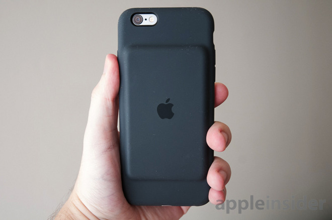
Apple's Smart Battery Case will certainly get the job done, but it includes some baffling design decisions, and just isn't a great value compared to third-party products.


First of all, to address the elephant in the room — yes, the case just doesn't look as sleek as most Apple products, with a protruding battery "hump" that some people have likened to an iPod, a deck of cards, or even a tumor. It's like a mutant version of Apple's regular Silicone Case.

In practice, the aesthetic issue is overblown. A charcoal black version looked smooth and well-made to our eyes, though it's liable to show scuffs and lint over time. And ultimately, it's a battery case — what matters is how long it lasts and how much protection it offers.


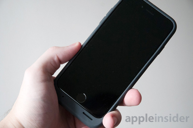
On the second point, the Smart Battery Case is engineered more to be light than rugged, but it does have a thick, grippy rubber exterior reinforced by plastic and metal. A raised lip helps guard the screen. Together these things are enough to protect against bumps and everyday wear and tear, and possibly a few drops if the screen doesn't take the brunt of the impact.

Battery life is decent, but not spectacular. Apple claims up to 25 hours of talk time or 15 hours of LTE data, compared with figures of 14 and 10 on a stock iPhone 6 or 6s. We tried the case with an iPhone 6, and found that in normal mixed use — with activities like Facebook, music, Words With Friends, and Google Maps navigation — we were left with a 12 percent charge on the case by the end of the day, about what you'd expect from an iPhone on its own.


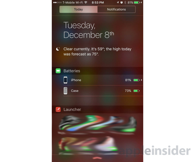
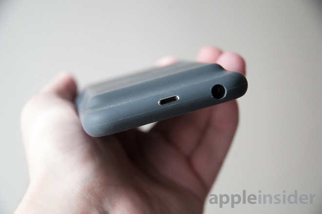
One of the neater things about the case its close integration with the Apple ecosystem. It uses a Lightning port instead of micro USB, which automatically makes it more convenient for a lot of people — especially those with Lightning docks. When you insert or remove a cable, it briefly displays both the phone and the case's power levels, and you can check that information again through an iOS Notification Center widget.

It'd be nice, though, if those separate levels appeared on the iOS lockscreen as well. Really there should be an external LED readout like other cases, which would do away with having to plug in an iPhone or swipe down on notifications just to gauge how much life is left.


On that note, some of Apple's other design choices are just bizarre. There is an LED charging indicator, but it's a basic on/off light, and it's located on the inside of the case — a place you won't see most of the time. There's no switch to turn the case off and save reserve power. And if you want to connect 3.5-millimeter headphones or stereo cables, the opening for them is too deep and narrow in many circumstances. An exception — naturally — is Apple's own EarPods.


The case's flaws might be overlooked except that Apple is charging $99 for a bare-bones product. That's almost criminal when you can get a decent Anker case for $40 that has a 2,850 milliamp-hour battery. For just a dollar more than Apple, you can get Mophie's tougher (and often better-designed) Juice Pack Air. If you're willing to spend about $130, you can get a case from LifeProof that not only charges your phone but makes it nigh-on indestructible.

Conclusions


Putting it bluntly — there's no reason to go with the Smart Battery Case unless you need something like it the moment you buy your iPhone and, mysteriously, no other option is available. It does what it needs to do, but at a high pricetag and with problems other casemakers solved years ago.

It's a shame, since the case's Lightning port and iOS integration is genuinely useful and sets it apart from the pack. Hopefully this is the harbinger of the technology coming to superior third-party accessories.

Score: 3 out of 5


Pros:
  • Tight iOS integration & Lightning port
  • Decent protection
  • Extra battery life enough for most of a day
  • Easy installation & removal

Cons:
  • Too expensive for included features
  • May be ugly to some
  • No external LEDs or controls
  • Makes 3.5mm port incompatible with some accessories

Where to buy

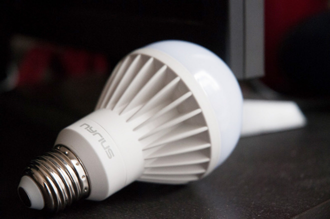
Review: Nyrius Wireless Smart LED Multicolor Light Bulb

Nyrius' Bluetooth-connected lightbulb might get the job done, but there's nothing that really sets it apart from rivals, and there are several things that set it back.


"Smart" LED bulbs have become increasingly popular, at least among people with plenty of disposable income. There's an inherent appeal in having lights change color on a whim, or automatically turn on when you enter a room.

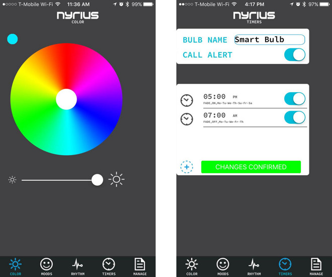
Initially Nyrius' bulb seems to tick a lot of the right boxes. It's controlled via an iOS or Android device, it offers scheduling options and a variety of colors, and it can even flash when your phone has an incoming call.

This review almost didn't happen, though. We actually received the bulb for testing a few months ago — but at the time, Nyrius' iPhone app simply wouldn't detect the bulb, no matter how hard we tried. We got in touch with the company, which blamed a problem with the app and promised an update. That fix came a few weeks later, and turns out to have corrected iOS 9 compatibility.

Although the bulb does work now, its app may still be the weakest link, since there are quirks and limitations that make the overall package feel shoddy. In the former category, for instance, there's no way to toggle the bulb on or off from the color picker screen without using the brightness slider — you have to do that from the Manage tab. And if you want to change the color to white, but you've recently switched away from the app, you can't just tap on the white circle — you have to choose another color before the option will respond.


Scheduling functions work reasonably well, allowing bulbs to turn or or off at certain times and on specified days of the week. Owners have to pick separate "on" and "off" schedules however, which makes sense to a degree but can add extra steps for some people, especially if they have complex schedules in mind.

You also can't control much of what happens during scheduled events. The only toggle in fact is to have the bulb fade in or out — you can't make it change color or brightness level, which should be obvious if not mandatory options. The fade isn't even that subtle, coming in steps instead of smoothly.

Another tab in the app, Moods, offers four presets: Reading, Dining, Relaxed, and Party. The first is just regular white lighting, and the other three are tacky — especially Party, which rapidly cycles between colors.

A final tab, Rhythm, tries to match lighting to music, but does this using your iPhone's microphone. That means it responds as much to talking as anything, and you have to leave your iPhone out and on to make it work.

Hardware


How does the bulb itself actually perform, though? Well enough, but not spectacularly. Like many LED bulbs, it's dimmer than normal incandescent or compact flourescent options, even when brightness is maxed out. It's fine as desk or accent lighting, especially given the power savings, and longevity potentially reaching into years or decades.

There are several selectable color tints: red, purple, blue, cyan, green, yellow, and a cool white. These all come out deeply saturated, which may not be to everyone's taste. We ended up sticking with white most of the time.

People thinking of going with Nyrius for home automation will probably be disappointed. There's no iOS HomeKit support, and while you can create multiple lighting groups, options don't get much more complex beyond that and the app can only handle eight bulbs. If you do want lights to turn on and off when you enter your house or apartment, you'll have to spend on one of the company's Smart Outlets.

Conclusion


If you don't expect too much going in, Nyrius' smart bulb may do the trick. It changes colors, it dims, you can program it to come on at night and shut off in the morning.

On the other hand, if you're truly invested in the idea of a smart home, there are other options out there with better apps and integration — in some cases cheaper, if you don't care about multi-colored lighting.

Score: 2 out of 5


Pros:
  • Long-lasting, power-sipping lighting
  • Several color options
  • Decent scheduling system


Cons:
  • Poorly designed app with some limited or useless options
  • So-so room illumination
  • Weak home automation support, no HomeKit ties

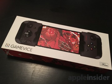
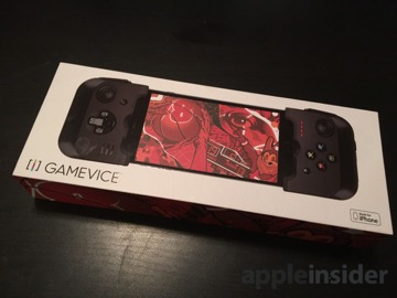
Gamevice Lightning-connected gaming controller for iPhone

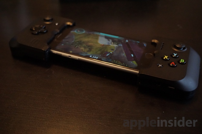
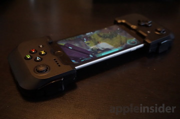
With a clever Lightning-connected design and solid construction, we're mostly impressed by the Gamevice gaming controller for iPhone. But with a $100 price tag, a risk of not fitting future iPhone models, and broken controller forwarding support from Apple in iOS, we feel it's an extremely niche device.

The Gamevice is a physical gaming controller that fits iPhone 6, iPhone 6 Plus, iPhone 6s, and iPhone 6s Plus. It's available through Apple's retail and online stores for $99.95.

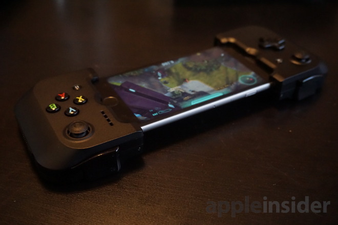
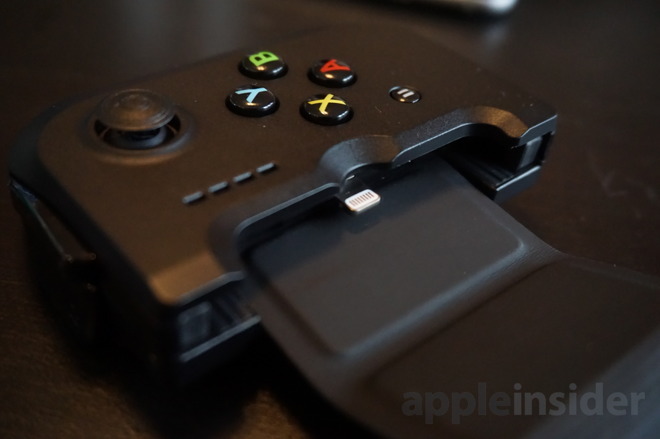
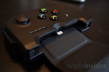
Like most other gaming controllers for iOS, it features two joysticks, a D-pad, four face buttons, and four shoulder buttons. It's powered by an internal 400 mAh battery, and connects to the iPhone via a Lightning plug, which means no need for a Bluetooth wireless connection.

Hardware

The Gamevice is noteworthy because it's the first Lightning-connected controller we've seen that fits the latest iPhone 6 and iPhone 6s series.

Both the Moga Ace Power and Logitech PowerShell with Lightning connectivity. But both of those were designed for Apple's iPhone 5 and iPhone 5s series, and do not fit the iPhone 6 or 6s.


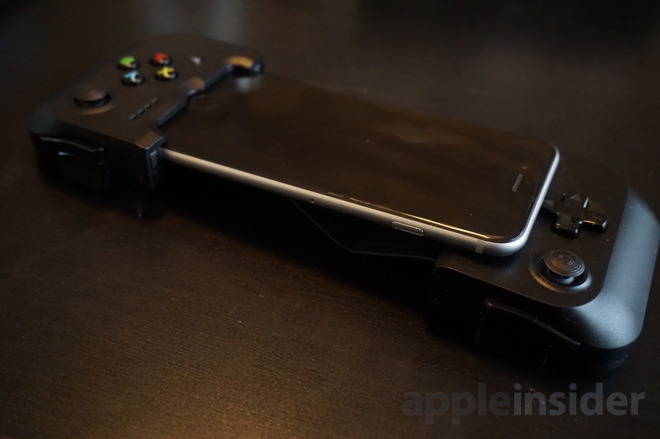
Right off the bat, this spotlights some of the issues the Gamevice may face down the road. A clever design for the Gamevice allows both the 4.7-inch iPhone 6/6s, and the larger 5.5-inch Plus models to fit the accessory, but there is no guarantee that a mythical "iPhone 7" will also fit.

We can't ding the product for this, because who knows what the future will bring. But still: Buyer beware.

We used the Gamevice with our iPhone 6s and found that we really enjoyed the clever design of the device.


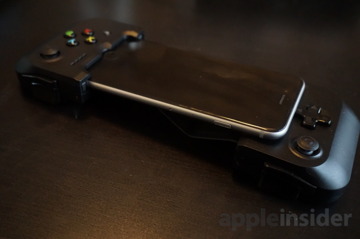
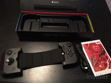
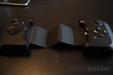
Gamevice has two pieces: a left side with the D pad and joystick, and right side with second joystick and face buttons of A, B, X and Y. Both sides feature both a trigger and bumper.

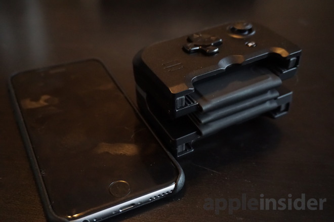
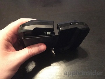
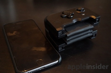
These two pieces are connected by a rubberized, folding piece dubbed the "flexbridge." When extended, the two sides of the controller fit securely around the iPhone and hold it in place. There is also an extension slider on the back, and a locking mechanism on the right side, to allow users to choose between fitting an iPhone 6/6s, or a larger Plus version.


When it's not in use, the flexbridge can be folded accordion-style and sandwiched between the two controller halves. These hard plastic pieces attach to the backs of one another magnetically.

This feature aids in the portability of the Gamevice, though it still isn't pocketable in any fashion. Still, we had no problems throwing the unit in a bag, and appreciated the collapsible design.

Connecting the Gamevice was also easy and simple. And when placed inside the snug slots and connected to the Lightning plug, we had no worries that our iPhone was going to fall out.


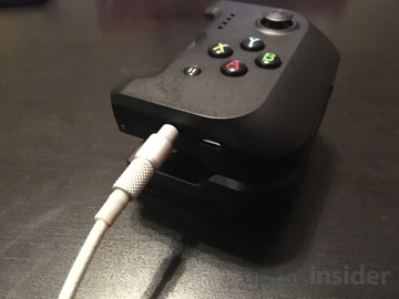
The unit recharges through a micro USB port, which also passes power through to the iPhone, allowing users to charge and play a game at the same time.

Another welcome inclusion with the Gamevice is a dedicated headphone jack. When used, iPhone audio passes through the Lightning port, allowing you to connect a standard 3.5mm headphone to the bottom of the unit. The device can also be used without headphones if you prefer.

Usage

We were pleased to find that the solid construction and design of the Gamevice also extends to the buttons as well. Both the face buttons and joysticks are responsive and well built, giving the controller a premium feel. The D-pad is serviceable, as most are these days.

If we had to single out a weak point, it'd be the triggers and shoulder buttons. They're not bad, per se, but they aren't as strong as some other iOS controller options — which retail for much less than the Gamevice.


Specifically, we take issue with the triggers, which lack any discernible "depth" to them. While the buttons can be pressed and give a satisfying feel of a click, there isn't any range for a lighter or deeper press as on other triggers, most notably the SteelSeries Stratus.

That issue aside, the Gamevice feels comfortable in the hands, and we had no problems using it for compatible titles like Geometry Wars 3, Halo: Spartan Assault, and the Metal Slug series.

As with other physical controllers, playing titles with the Gamevice is vastly superior to touchscreen-only controls, for most games. If you buy this controller, you will have a much better gaming experience.


Our main knock against MFi controllers remains Apple's fault, because the iOS App Store does not identify which downloads support third-party gaming controllers.

Apple addressed this issue with the new Apple TV and tvOS, but the problem still remains on iOS. Gamevice has, thankfully, addressed this in its own way, and offers the "Gamevice Live" app as a free download.

We're happy Gamevice Live exists, though the app is glitchy. When scrolling, we found that it would frequently accidentally select an app.

Aside from this bug, it's well designed and does what it needs to do. Gamevice Live is a curated list of controller-compatible apps, addressing a problem that Apple created.

There are three tabs — Featured, Explore, and Search — while apps are sorted in categories like "New Games" and "Our Favorites." It's a nice way to discover titles for your new accessory.

The app also displays Gamevice-specific controls, featuring images showing exactly what buttons on the device will accomplish certain tasks in specific games.

Of course, much of this wouldn't be necessary at all if Apple simply displayed controller support in iOS App Store listings. The company has done so on tvOS, but has not on iOS. And there is no way to use Gamevice with tvOS (yet). Which is another Apple-related issue in and of itself.

Controller Forwarding (or not)


It should be noted that the Lightning-connected design for the Gamevice makes it a much better option for iPhone gaming on the go than, say, the excellent SteelSeries Nimbus. While we had high praise for the Nimbus, its lack of any sort of mount for the iPhone makes it an Apple TV- or iPad-only affair.

It's for that reason that we were particularly keen to try out a feature Apple introduced back in iOS 8, dubbed "Controller Forwarding."

Controller Forwarding is intended to extend the value of Lightning-connected controllers by allowing them to be used wirelessly with other devices, like an iPad or Mac. In theory, an iPad or Mac running a compatible game would connect to an iPhone with a Lightning controller attached, like the Gamevice.

When Controller Forwarding was introduced at Apple's 2014 Worldwide Developers Conference, the company made it sound like the feature would "just work," with minimal effort needed by users or developers. Supposedly, any game supporting the default setup for physical gaming controllers would be able to use Controller Forwarding.

Considering the Gamevice was the first Lightning-connected controller we got our hands on since the launch of iOS 8 and the iPhone 6 in 2014, we were excited to see how well Controller Forwarding works.

The answer: It doesn't really work at all.


In our tests, only a handful of games even showed the option to connect our iPhone 6s with Gamevice to our iPad Pro. Both devices were running the latest version of iOS 9.

In the event that we were shown the option to connect (either via the lockscreen or the app switcher), the controller either didn't properly connect, or it just didn't work at all.


In short, we couldn't test Controller Forwarding with the Gamevice, because we couldn't get it to work, despite repeated attempts, and a request for help directly to Apple.

From what we could find, there is no Controller Forwarding support for tvOS either. This means your $100 Gamevice will only work with your iPhone, and nothing else. For now.

Conclusion


If you're OK with the fact that it might not fit an "iPhone 7" and beyond, and you don't mind the $100 price, there's a lot to like with the Gamevice. The unique design works.

But as it stands, you will only be using your Gamevice with an iPhone 6/6s or Plus. Without functional Controller Forwarding, as far as we could find, you can't use this device with your iPad, Mac or Apple TV.


Still, at $100, this is a pricey accessory. Especially when you consider that there are other models with iPhone clamps for playing on the go that cost half as much as the Gamevice, or less.

If you want an iPhone controller and don't mind Bluetooth connectivity, the MadCatz C.T.R.L.i series features a removable iPhone clamp and can be had for under $50, though it lacks a rechargeable battery, instead relying on AAAs. There's also the Moga Rebel, which costs $80 and does have a rechargeable battery.

Regardless, it's good to have options, and the Gamevice's unique design makes it a welcome addition to the lineup. We just have a hard time recommending it over other options at its current $100 price point.

Score: 3 out of 5


Pros

  • Lightning connection makes it easy to plug and play
  • Solid construction is comfortable in the hands
  • Unique design allows all iPhone 6/6s and Plus models to fit
  • Collapsible for extra portability (though not pocketable)


Cons

  • The triggers lack depth, serving just as basic buttons
  • $100 price point is too high
  • Apple still doesn't identify compatible games on the iOS App Store
  • Apple needs to fix Controller Forwarding in iOS 9

Devialet Phantom is a high-end speaker

Developed by niche French audio firm Devialet, the Phantom has achieved wide acclaim from industry acolytes for impossibly low-distortion sound reproduction rivaling that of speakers ten times the cost and many times the size. It's also the latest chic accessory to be featured in Apple's retail stores.


Devialet, like many high-end audio component makers, has a penchant for puffery. Phantom's literature is rife with superlatives, a requisite flotilla of acronyms and detailed rundowns of imaginatively named technology — "Magic Wire" being a personal favorite.

I cracked a grin as I read tale of Devialet's millions of dollars' worth of R&D that resulted in dozens of patents protecting hybrid analog/digital amplification, Heart Bass Implosion and other industry firsts. It was deliciously over the top.

Smash cut to me plugging it in and cranking up some Ludwig Van to 11. Phantom blew that silly smirk off my face, taking most of my Movember mustache with it.

Design


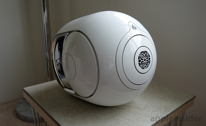
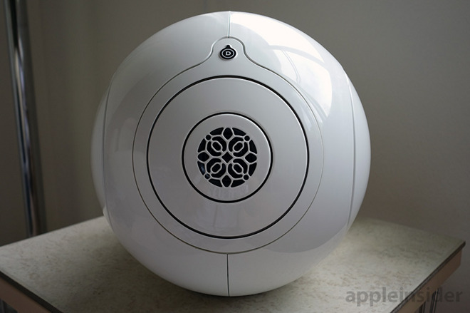
Both Phantom and its more powerful Silver Phantom sibling are decidedly biomorphic in design, that is they look like an organism, but not anything of this world. There is no close approximation to Phantom's aesthetic in contemporary consumer electronics, imagine the lovechild of a first-gen iPod and something out of an H.R. Giger-fueled fever dream.


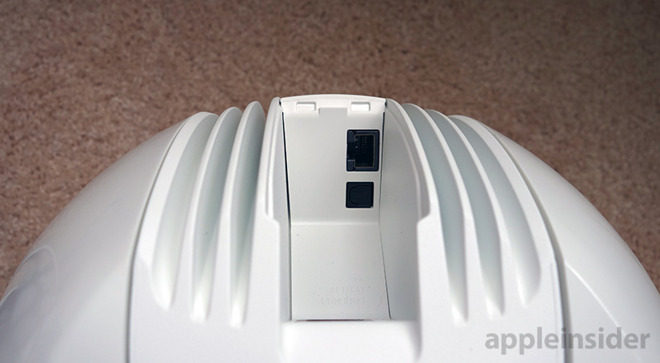
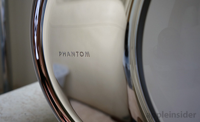
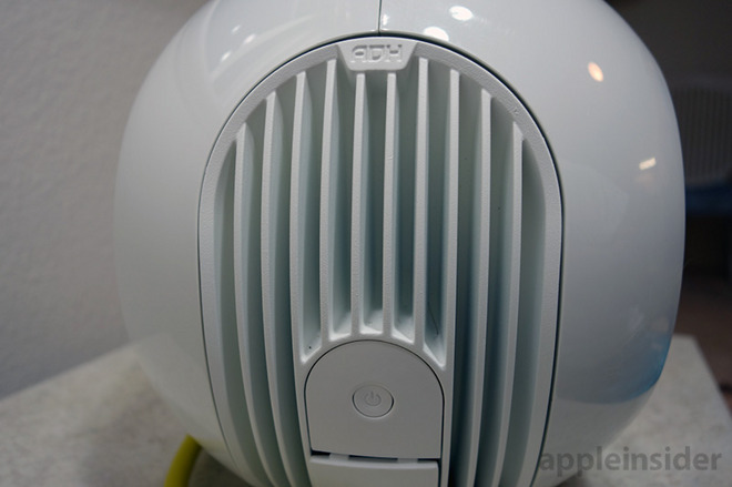
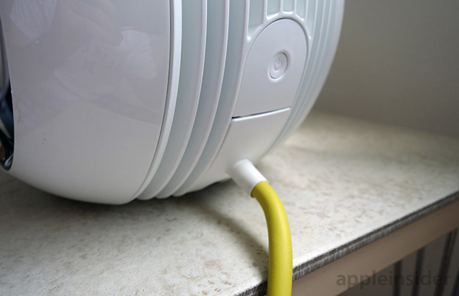
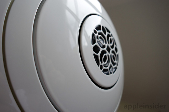
On the outside Phantom looks like a shiny plastic, modern art kidney bean. A hard, white ABS shell wraps around an inner skin crafted from Kevlar. Despite its appearance, the unit is quite heavy at just over 24 pounds, with most of that weight tipped toward the front speaker assembly. The fins of a substantial heat dissipator are exposed out back, where the power input, Wi-Fi power button, Ethernet port and optical jack also reside. Two polished stainless steel sidewalls finish off the futuristic look.

Overall the build feels extremely solid and Devialet says there are only ten modules per assembly with no interconnect wires to speak of.


According to Devialet's white paper, the Phantom's distended egg shape is so designed to accommodate the two custom "Heart Beat Implosion" aluminum drivers that sit across from each other beneath two domes, again constructed out of thin aluminum. The diaphragms of both bass drivers, and that of the coaxial midrange and tweeter drivers situated at a 90-degree angle to said woofers, sit flush with a spherical superstructure, focusing sound waves toward Phantom's vacuum sealed center. The idea is to get as close as possible to creating a single point in space, out of which sound emanates.

It's worth repeating that Phantom's symmetrical bass drivers pulsate — with reckless abandon at high volumes — and without a speaker grille could end up touching nearby equipment. In short, Phantom needs some breathing room to operate at maximum efficiency.


Phantom's design principles are based heavily on the work of prolific RCA engineer Dr. Harry F. Olson, who proved that spherical speaker cabinets are far superior to rectangular boxes when it comes to diffraction loss. Called "co-spherical" by Devialet, the driver arrangement propagates sound waves evenly so every listener in the room is treated to the same sonic experience. Unlike traditional speakers, or "omnidirectional" cylindrical designs, there is no sweet spot.

Like any piece of audiophile hardware worth its salt, Phantom comes packed with cutting edge — almost mystical — technology. At the forefront is "Magic Wire," a "leak-less" electrical path that moves signal current from the 24-bit Texas Instruments PCM1798 DAC to the circuit's resistor and ultimately class A amplifier. Devialet figured out how to convert DAC output into high-voltage current without an op-amp or current mirror, making for an extremely quiet path.

The next stage is an analog/digital hybrid amplification system (ADH), which has at its core a class A amp assisted by multiple slaved class D amps running in parallel. Devialet managed to squeeze both the Magic Wire path and the class A amp on a single board, of which there are two in every Phantom. The last piece of the puzzle is Speaker Active Matching (SAM), a method of signal processing that dynamically matches amp output and driver motion, ensuring the peaks and troughs of generated sound waves mirror those of the original signal when it hits users' ears.

The speaker's circuitry might require an engineering degree to fully comprehend, but the amazing sound it produces does not.

Performance


Thinking of a way to adequately describe Phantom's sound results in antithetical word pairings. "Unbridled but sophisticated." "Loud but refined." "Raw but silky."

Phantom boots up automatically when connected to power, the two hemispherical aluminum domes pulse in and out twice, signaling the speaker is ready for use. There is no on/off switch, or any other audio-related physical controls for that matter, which means power cycling is automated. Opening the free Spark app or connecting via Bluetooth takes the speaker out of its resting state.


We put our 750-watt unit tester through the paces using a variety of codecs and file formats at bitrates of no less than 256kbps, including aptX (not available on iPhone), AAC, MP3, Apple Lossless, FLAC and OGG Vorbis. For data transfer, we tested both A2DP and AVRCP Bluetooth profiles, optical input and Wi-Fi via Devialet's free Spark iOS app. Due to an incompatibility with files stored on our iPhone, we rarely used Spark save for volume control on connected optical devices.

At low volumes Phantom is clear and crisp, leaning ever so slightly toward a bright bias. The bass kicks in at normal listening levels (those that can't be heard through walls or solid core doors) tight and refined with punchy and immediate response. There was no sign of slop, echo or unwelcome decay.

Phantom is best when driven hard. Clarity and bass are present at low volumes, but it is at about 60 percent of max when the system comes into its own. Allowed to run free across their 26mm peak-to-peak stroke, the co-spherical woofers displace massive amounts of air for a deeply expressive thump. Bass hits are precise, closely mimicking the kick of a bass drum, the sustained moan of a tuba or a timpani's rolling grumble.


There is a point, about 95 percent full blast, where you think Phantom is going to crack. It has to, but it doesn't. The sound somehow gets tighter as the decibels rise. If you hear a shake, rattle or hum, it's the recording or whatever the speaker is sitting on.

Most impressive is the system's composure. The highs and lows are always in balance and tangibly separated across the acoustic spectrum, but more importantly timing is flawless with not even a suggestion of phase shift. It all equates to an exceedingly layered and complex, but candid, sound signature.

With its small displacement chassis and "implosive" driver design, Phantom cuts a well mastered recording to the core, threshing out chaff to leave it bare for your listening pleasure.

Conclusion


Phantom is priced well above mainstream wireless speaker offerings, but there is quite literally no other product like it on the market. It delivers on Devialet's promise of poise and power, and for many will be a steal even at $1,990.


If, however, you're looking for a true stereo rig, Phantom cannot oblige. The speaker's output is immersive to be sure, but one will need more than a standalone for a truly expansive soundstage. Luckily, Devialet makes an audio router called Dialog specifically designed to pair up Phantom and Silver Phantom models. Up to 24 can be chained together, great for multi-room mansions or commercial theaters.

After testing Phantom for a week, I'm sold on the sound, the tech, the price — all of it. We suggest a demo at louder volumes to get a feel for the hardware's capabilities, which likely disqualifies the nearest Apple Store. Devialet does, however, offer a 45-day risk free trial. Barring, that is, the risk to your wallet.

Score: 4.5 out of 5


Pros:
  • Zero distortion
  • Faithful, uncolored sound reproduction
  • Gobs of power
  • Competitively priced high-end device

Cons:
  • Expensive compared to consumer products
  • Power goes to waste at "normal" listening levels
  • Single unit lacks soundstage